It’s election time in Ontario and that means graphs and statistics, facts and factoids, some stale, some new come out of the woodwork. Take the tweet below as an example, one that riffs on the old theme of an exploding public sector encapsulated in Tim Hudak’s promise to cut 100,000 public service jobs:
Hudak promises to cut 100K public sector jobs (with education bearing the brunt). I put together this chart. Discuss pic.twitter.com/aNJjz5tiJ1
— Ben Rabidoux (@BenRabidoux) May 13, 2014
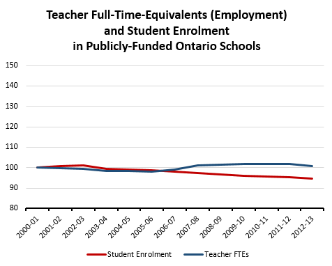
Let us even take the author’s word that he is non-partisan and found some seemingly interesting data; the focus is the chart, not him. There are two issues. The first is much simpler: the graph is a misportrayal. It uses data from a Statistics Canada sample-based survey to proxy for teacher employment and population data to proxy for student enrolment. While using proxies for missing data can be acceptable and justified, in this case, there is absolutely no reason for it. Both teacher employment data and enrolment data are exhaustively compiled by Ontario’s Ministry of Education. Here is the same graph with correct data:
