The question of who pays for austerity and how is an enormous one. Promoters of austerity often claim that cuts to universal services are fine if they’re offset by transfers to those who can’t pay for newly-marketized services. The same goes for expanding services – why give everyone childcare if you could just give those at the bottom the money to pay for it the same as those who can afford it?
There are many arguments for why services should be public and universal that do not simply rely on whether everyone is able to pay for them privately. However, even on their own terms, the argument for ramping up transfers to the bottom of the income distribution hasn’t held up in recent times.
I was intrigued by a post from Matt Bruenig that compares the US and Finnish tax and transfer systems, arguing that while the Finnish system looks less progressive by some measures, this is due precisely to higher and universal transfers. I’ve been looking at lots of data on the latest phase of austerity in Canada that began at the federal level with the election of the Chretien Liberals in 1993. Here, I’ll steal some of what Matt does and apply it to the Canadian tax and transfer system since then.
For starters, here are average gross government transfers by quintiles in Canada. This is how much money people receive in the form of cash benefits and credits from all levels of government. This is thus only a rough picture of what’s happened at the federal level, but most transfer income is federal. The first chart is for 1993 and the second is for 2011 (the last year of publicly-available data); everything is adjusted for inflation to constant 2011 dollars.

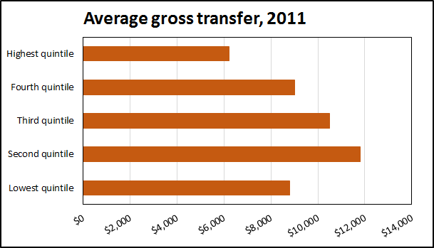
What’s striking is how similar the two charts are. While the economy has grown – 35% growth in real GDP per capita between 1993 and 2011 – government transfers have essentially stagnated for everyone. The bottom 40% have actually lost in transfer income and only the fourth quintile saw any kind of sizeable increase gaining just above 10%.
Next, let’s add income taxes into the mix. Here are the same two charts, but this time showing net government transfers. This is the difference between the transfers above and income tax paid to all levels of government.
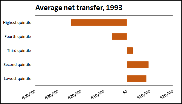

Again, we have little change over almost two decades except for a lower net transfer to the richest 20%, though this is likely a reflection of the growing inequality in market incomes, especially higher top incomes (and hence higher income taxes). Remember too, that this shows a more progressive structure than if we took all taxes including those on consumption as well as user fees (again, paying more with stagnant transfers) into account. This total tax structure is far less progressive – somewhat regressive even in some provinces.
Here is another way to look at the changes in same net transfer data, showing the trends in time over the entire 1993-2011 period.
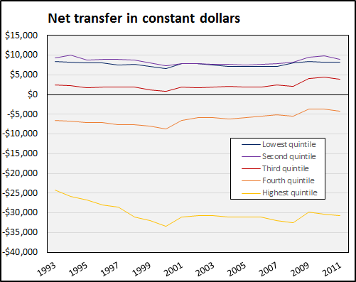
We can divide what’s happening into a few distinct periods at the federal level (provinces do more direct spending). Clearly visible are
- a main phase of Liberal austerity from 1993 and 2000,
- a short upturn after the 2000-era tax cuts (since net transfer = gross transfer minus taxes, a reduction in tax means the net transfer goes up)
- a general stabilization since then, only punctuated by
- the fall in incomes and short-term fiscal expansion after the 2008 crisis (with a clear trend back to the stabilization or lower in the last years of data).
Finally, here is a last chart that takes net transfers and divides them by market income. That is, it shows what percentage of market incomes is received on average by each quintile as net government transfers.
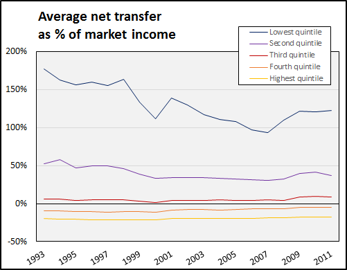
This last chart is combines the picture of growing inequality with transfer stagnation. Economic growth is not translating into shared resources, whether in the form of existing or much-needed new public programs or even simply being pooled for redistribution. This certainly points to austerity falling disproportionately on the backs of the poorest.
Note: all data comes from Statistics Canada, CANSIM Tables 202-0703 and 202-0704.